Usually, I really miss my old job at the public library, but getting two and half weeks off for Christmas reminds me that being a teacher has its perks! I did a lot of reading on my Kindle this break, mostly Amanda Hocking's stuff. I read both books in the Trylle trilogy (eagerly awaiting the third and final installment on January 15th) and four books from the My Blood Approves series. I really enjoy Amanda Hocking's writing style and the price can't be beat. Although my husband did question all those $2.99 charges from Amazon. Side Note: Torn (Trylle Trilogy #2) had so many typos in the Kindle version. It drove the English major in me nuts!
I also read Lauren Kate's Fallen, but was so disappointed it in that I didn't bother reading the sequel. I really like her book covers, though.
One thing I love about the Kindle is that the prices for young adult books are so reasonable. I wish the adult fiction prices were as low. I just can't bring myself to pay more than $5.00 for a book that I can get from my library for free.
Showing posts with label book covers. Show all posts
Showing posts with label book covers. Show all posts
Wednesday, January 5, 2011

Monday, August 9, 2010
UK Covers
Cheerio! I've spent most of the summer "studying" in jolly ol' England, but I'm back now. And of course, I couldn't help but peruse the YA sections of UK bookstores.
Just a general comparison of some YA titles: (notice Shiver is the same but the colors are different)

I found myself wishing for the UK versions of most of the books, but this was one exception. Look at the terrible cover for What I Saw and How I Lied:

Another thing I found really interesting was the difference in the way some books that are YA here are Adult there, and vice-versa. All of Cory Doctorow's books, for instance, were in the Adult section. And then, as you can see from this photo, Holly Black's White Cat was in the adult section too. The sticker on it says, "A novel for grownups by the author of Spiderwick."

Just a general comparison of some YA titles: (notice Shiver is the same but the colors are different)
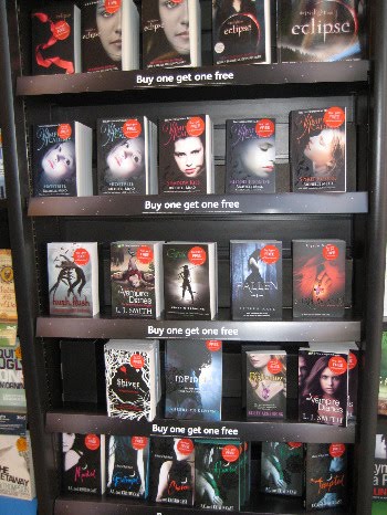
I found myself wishing for the UK versions of most of the books, but this was one exception. Look at the terrible cover for What I Saw and How I Lied:

Another thing I found really interesting was the difference in the way some books that are YA here are Adult there, and vice-versa. All of Cory Doctorow's books, for instance, were in the Adult section. And then, as you can see from this photo, Holly Black's White Cat was in the adult section too. The sticker on it says, "A novel for grownups by the author of Spiderwick."

Thursday, July 1, 2010
Publisher's Weekly: Autobiography of a Cover
A recent cover story of Publisher's Weekly focused on the amount of thought and energy that goes into creating the cover design for most YA books (the article focused on Sara Shepard's Pretty Little Liars series.) Although the article was perhaps a little light in content, it was interesting to get a behind-the-scenes explanation of how the covers are put together (though they failed to explain how so many covers can end up with the exact same photo!) I'm guessing the $26,000 price tag has something to do with it...
Wednesday, June 9, 2010
Cover Twins
I noticed that Wendy Toliver's new book Lifted has the same cover photo as Ann Dee Ellis's Everything is Fine, just a slight cropping of the model's head. I like the new version much better (ie. I never liked the coloring on EIF).


Monday, March 1, 2010
Another Post on Book Covers
I really love the topic of book covers because good books with bad covers are something I really hate to see. So I liked this humorous post "Why Book Covers are So Very Clichéd" by Mark Charan Newton. I actually don't mind clichéd book covers. I think I posted at some point about how book covers with girls holding a guy's hand (think Sarah Dessen, Susane Colosanti, and Simone Elkeles) may be clichéd, but they attract their target reader. When someone sees that cover, they know what kind of book it is, and they will probably be interested if that's the kind of book they normally like. Example: Catherine Gilbert Murdock's Dairy Queen would appeal to lots of these types of readers, but they don't know that based on the cover of a cow wearing a tiara, and they aren't the least interested in reading that book, no matter how inventive the cover. I read a great article in Romantic Times about the meaning of romance novel covers and how the style clearly indicates to the reader what type of romance they're going to read (urban fantasy, historical, light contemporary, etc.). Yes, they're usually cheesy and maybe even embarrassing to buy, but you know what you're getting. I was at a bookstore recently with a friend, and he would pick up a romance novel and I'd tell him what it was about based on the cover. Example:
"That's a contemporary romance about a woman who owns a bakery or a dog-walking business," I'd say. Verdict: It was indeed about a woman who owned a dog-walking business. See? People know what they're getting, and that's not necessarily a bad thing.
"That's a contemporary romance about a woman who owns a bakery or a dog-walking business," I'd say. Verdict: It was indeed about a woman who owned a dog-walking business. See? People know what they're getting, and that's not necessarily a bad thing.
Friday, August 14, 2009


Friday, April 24, 2009
What We Want Publishers to Know
Unshleved has this pdf booklet for BEA about what librarians and booksellers want publishers to know. It's great! I agree with everything. I especially want to "amen" the stickers one and the one about a synopsis. I suspect the one about the dust jacket also relates to having a synopsis. Books without a synopsis will not check out, no matter how great the cover is (case in point: Madapple). I'd like to add these:
1. Put the volume number high on the spine so it won't be covered up by spine labels or other stickers we use. This is especially important for manga.
2. Make the spine appealing too. Like this.
3. If a book is in a series, make it clear what number that particular book is. Preferably on the cover but on the inside on a title or separate series page will also work. A list of all the books of the series in order would be appreciated.
1. Put the volume number high on the spine so it won't be covered up by spine labels or other stickers we use. This is especially important for manga.
2. Make the spine appealing too. Like this.
3. If a book is in a series, make it clear what number that particular book is. Preferably on the cover but on the inside on a title or separate series page will also work. A list of all the books of the series in order would be appreciated.
Tuesday, March 24, 2009
Book Covers
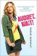
 In thinking about the repackaging of Judy Blume's books (and others), it has me thinking about how ruthless I've become about book covers. I know the saying is "never judge a book by its cover," but people obviously do. I have lots of books that I'm sure are great that no one ever checks out because the cover doesn't attract them. I've already mentioned several times how I have to practically beg people to read Lockhart's The Disreputable History of Frankie Landau-Banks because of the cover (hopefully the paperback will have a better cover).* Therefore, unless it's an already-popular author or series, I pretty much always consider the cover before I decide to buy something now. As I go through my review magazines and circle the books I want to order, on many of them I write "cover." On those, I look at the cover before I decide if I want to add it to my Follett list. There have been some books here recently that I wish I had the paperback version of instead of the hardback just because of the cover (examples: Dairy Queen and How to Ditch Your Fairy). I agree with pretty much everything that Jennifer at YAbooknerd said in this post about the topic. The only thing I disagree with is the preference for the original DQ cover. Someone else's blog (I forgot who!) was also saying recently that they liked the original Audrey, Wait cover better than the paperback because the paperback is just like all the other girly YA books. The girly covers are pretty popular with my students. They are attracted to those because they know those "types" of books are the ones they enjoy. I haven't seen anyone checkout out Dairy Queen all year, but I know a lot of my Sarah Dessen fans would enjoy it. They have no interest in it, though, because the cover doesn't give you any hint that it might appeal to that kind of reader.
* [Side note: I'm sure no one else reading this ever watches "Platinum Weddings" on WE, but the art from Frankie is the same as that on "Platinum Weddings."]
Sunday, December 7, 2008
Book Covers
The Book Design Review has its best book covers of 2008. There are no YA books, but it got me thinking of my favorite book covers. I hate when a great book has a bland cover. Students will pick up a boring book with a great cover over a great book with a boring cover any day, and I don't blame them. Even when the cover is "perfect" for the book, that doesn't mean it's going to interest anyone in picking it up off the shelf. It's soooo frustrating for me as a librarian to get books with covers that I know are not going to sell the book. I love Hunger Games and Little Brother and I've been able to hand-sell those easily to students, not to mention they share them with each other, but the covers of those books could have been so much cooler. I didn't dislike those covers; they just didn't do justice to their books.
Here are my favorite covers of this year:


Here are my favorite covers of this year:
Tuesday, February 5, 2008
Love Sucks
We have a bulletin board outside the library in the hallway. I manage to change it out every month-6 weeks or so and usually do something themed with the season. In "honor" of Valentine's Day, I put one up last week that is black with red lettering that says, "Love Sucks." It has two drops of "blood" dripping from the letters. Around that are book covers from teen vampire love stories. This has been so poular, I cannot even tell you. I pretty much do these bulletin boards because (a) we are in charge of decorating it, (b) I'm creative like that, and (c) it just seems nice to give students something fun and new to look at when they pass by. But this one has lead directly to several checkouts. Almost every day I have at least one person come in and ask for a book that is on the bulletin board. Today I had three people ask about the books. One girl even wrote down 5 titles to inquire about. I had no idea it would be so popular. If I get a chance, I'll try to take a picture and post it.
Saturday, January 26, 2008
Ink Exchange, Laurell K. Hamilton, Book Covers, & More!
OMG, this story is so fun! Smart Bitches Trashy Books (who helped me get my first-ever "Bluff the Listener" answer right on "Wait Wait...Don't Tell Me" last week) summarizes the kerfuffle that's been going on over this blog post on the St. Louis Post-Dispatch by Jane Henderson called "Laurell K. Hamilton knock-off for teens?" SBTB summarizes everything better than I can, but essentially, Henderson got a galley of Melissa Marr's Ink Exchange (I'm so jealous!!!) and decided from the cover and summary of the book that it is a "knock off" of Hamilton's Merry Gentry series. I love this stuff because it combines my interest in YA and romance novels. Let's be honest, there are some common elements that occur in certain subgenres of both, as I commented on just the other day. However, I am just so at a loss as to why and how Henderson came to these conclusions to intimate "copyright infringement" and a "knock-off." SBTB and the link they reference to Urban Fantasy Land do a good job of refuting most of the problems with Henderson's post. But let me stress some of my biggest problems:
1. Holly Black commented and pointed out that, hello?, these are not the only two people writing about faeries! And no one has a monopoly on writing about them either, just like no one has a monopoly on writing about vampires or vampire hunters or souls who inhabit living humans' bodies.
2. Having said that, I guess if you are not a connoisseur of any of these genres, then you might think they are all "pretty much the same." I don't think that, but I can see how people would. (Hot vampire who is centuries old attracts a young human female who wants to turn vampire to be with him, the love of her life.)
3. I totally do not get the cover art comparison at all. Only in the broadest, most utterly general sense would I say the covers look anything alike. And I know Marr's art was designed specifically based upon events in the book and that her own tattoo artist designed the tattoo (which appears in the book). For examples of how similar book covers can look, just take a look at a couple of the examples on Jacket Whys (or anywhere else, really). Seriously, I think Henderson is really stretching on this one, and/or really didn't think too long about it before posting.
4. I haven't read Ink Exchange yet (but I'd love an ARC!), but although Wicked Lovely did have a little romance, it was far from erotic. Let me direct Henderson to Nick & Norah's Infinite Playlist and others if she wants some hot YA action.
1. Holly Black commented and pointed out that, hello?, these are not the only two people writing about faeries! And no one has a monopoly on writing about them either, just like no one has a monopoly on writing about vampires or vampire hunters or souls who inhabit living humans' bodies.
2. Having said that, I guess if you are not a connoisseur of any of these genres, then you might think they are all "pretty much the same." I don't think that, but I can see how people would. (Hot vampire who is centuries old attracts a young human female who wants to turn vampire to be with him, the love of her life.)
3. I totally do not get the cover art comparison at all. Only in the broadest, most utterly general sense would I say the covers look anything alike. And I know Marr's art was designed specifically based upon events in the book and that her own tattoo artist designed the tattoo (which appears in the book). For examples of how similar book covers can look, just take a look at a couple of the examples on Jacket Whys (or anywhere else, really). Seriously, I think Henderson is really stretching on this one, and/or really didn't think too long about it before posting.
4. I haven't read Ink Exchange yet (but I'd love an ARC!), but although Wicked Lovely did have a little romance, it was far from erotic. Let me direct Henderson to Nick & Norah's Infinite Playlist and others if she wants some hot YA action.
Thursday, January 24, 2008
The Value of a Good Cover
Okay, since I blogged about L.J. Smith's Vampire Diaries, I thought I'd also point out how great it is to republish good books with better covers. The original wasn't awful, but the reissue is much more likely to attract teens than the dated one:


Another cover art change I really liked from the hardback to the paperback:


Who wants to read about a cow?


Another cover art change I really liked from the hardback to the paperback:


Who wants to read about a cow?
Subscribe to:
Posts (Atom)